Sunday, May 28, 2017

White Hot

As of late, the Flames have chosen to emphasize black over white in their identity, which works, but it doesn't mean you can't be nostalgic once in a while!

I kept red as a primary colour, but recoloured the current crest to the 1995 version. From that mess, I salvaged the white and red shoulder length yokes, but instead of striping cutting them off, I gave them outlines matching the hems and logo.

At the end of the yokes, I added a little flame design that gives the set a unique feel, but doesn't overpower it.

I kept the equipment black, and the slightly outdated font, but I also added the former secondary logo to top it off.

What do you think?
Comment below!

Saturday, May 27, 2017

Colours of Colorado

I've got two concepts to show off today, both on Colorado-based teams. It's been a while since I made these, but they're up there with my favourite concepts I've ever created.

First, a Colorado team still active, the Eagles of the ECHL.

They have one of the nicest minor-league logos ever, and colourful ones too. But they currently stick with these ugly uniforms, that don't use most of those colours and have black as a primary colour.

Most concepts just stick the blue-yellow-red pattern on a blue jersey, then make a white version, but the colours fight for dominance. To fix this, I did something I rarely do- kept the black primary. And dare I say it works?

On the black jersey, I slapped down the classic pattern, but also layered Blue Jackets-esque piping underneath it on the arms, replacing red with yellow.

I applied that pattern to a faux lace collar, then applied one-colour numbers. Needless to say, I used the wordmark-free version of their logo.

For the white jersey, I kept most of the black jersey: the hems, the pattern, the collar and the Blue Jackets-esque black full-length yoke, keeping the black dominant. For a final touch, I added a yellow outline to the back number.

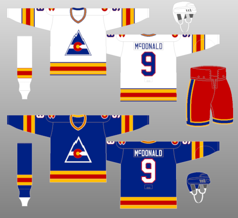
Next up: the Colorado Rockies, a defunct NHL team that moved to New Jersey and became the classic looking Devils. They didn't have bad uniforms per se, but their colour balance wasn't too good either.

Naturally, I completely contradict everything I said about the Eagles' uniforms. I kept blue as a primary, and actually added another colour on the home jerseys: white.

This wasn't done without a reason; I feel the trick to this type of colour balance is to keep almost the exact same pattern on both jerseys, just with a few elements tweaked for consistency's sake.

On the blue jersey, I made the dominant, eye-catching pattern equal stripes of yellow and red. I spaced out a white outline on either side, and added a white hem.

I kept the collar simple yellow and red, but used white faux-laces and a white Adidas logo. White once colour numbers finish it off, once again.

On the away jersey, I kept the blue upper arm fill, and most of the striping pattern, but added a blue hem to balance it all out, plus blue one colour numbers.


What do you think?
Comment below!

Thursday, May 25, 2017

Silver Wings

Let's get this out of the way: the Detroit Red Wings' uniforms are untouchable. (Spoiler alert: I touched them.) But in starting up a new series, in which I add a colour to each team's colour scheme, I saw a perfect opportunity to modernize the Wings brand, by adding a touch of silver.

I started off with the classic red sleeves for the white jersey, but removed the red cuffs. I added a silver stripe at a distance inspired by the logo's wheel, and reversed the pattern on the hem.

I outlined the logo, collar and numbers in silver, and reversed red and white for the home jersey. 


What do you think?
Comment below!

Wednesday, May 24, 2017

Canuck Simplicity

The Vancouver Canucks have a nice set, but a number of easily fixable issues currently present still bug me. So, naturally, I decided to fix them.

The Canucks already got it right with the one-colour numbers, but I chose a more classic font to go along with my logo choice, the modernized Stick-in-the-Rink.

Their home jersey is almost perfect, but they added one too many stripes on the away jersey, so I decided to do away with that and add an upper-sleeve fill to better incorporate the classic Vs I reinstated on the sleeve stripes.

Vancouver currently has a multitude of amazing secondary/primary logos, one of the best sets in the league, but I decided to leave the shoulders blank on this simple of a concept.


What do you think?
Comment below!

Tuesday, May 23, 2017

Identity Swap: Bolts and Stars

While I've made other concepts, I haven't stopped with my Identity Swaps. This time, I made a full swap between the Stars and Lightning.

This pair was obvious to make, since when the Stars announced their rebrand a few years ago, everyone freaked out about the possibility of the Stars copying the Lightning and playing Original 6 Dress-Up. (I guess we should've paid more attention to the Hurricanes, but that's another story.

The first swap, Dallas in the style of Tampa, was pretty straightforward. I replaced all blue with green, and all bolts with stars. For the pants, since stretching a star down the length of the pants wouldn't work, I decided to go with a mix between both teams' 90s styles.

On the away jersey, I replaced "Tampa Bay" with "Dallas".  


The next swap had the same eases and difficulties, but this time the bolt-star dimensions mismatch is more front and centre, on the primary logo.

To try to fix it, I tried many combinations, before coming up with this, which looks less layered than the Stars logo.

The rest was straightforward, replacing green with blue.

What do you think?
Comment below!

Monday, May 22, 2017

Classic Leafs

 When I saw the Leafs jersey redesign this year, I was disappointed. While it's beginning to grow on me, I still feel like there are tonnes of options they could've gone with to accompany their amazing new logo.

The first place I looked for inspiration was the socks they ditched after years for their new design. I wanted to keep those.

So, I went with an arm design based on those socks, with a little box for the TV numbers inside the middle stripe. On the hem, I only kept one set of Northwestern stripes on the hem to simplify the look.


I also liked their St. Pats jersey this year, but it only works on St. Patrick's Day, so I wanted to modernize them to be used as a full-time alternate jersey.

First off, I replaced all the green with blue, then reversed the blue and white to make it a dark jersey. I kept the simple striping pattern, but replaced the logo with a wordmark from the current leaf laid out like the original St. Pats jersey.

To stay consistent with the chest logo, I also put the numbers, in their current font, in the sleeve stripes. To finish the jersey off, I made a new shoulder patch, putting the old shoulder patch's veins inside the new leaf.

I really like how it came out.


What do you think?
Comment below!

Sunday, May 21, 2017

Blue Preds

Ever wanted to see the Preds back in blue? Look no further.

This is an update on an old Preds concept. White is prominent on the blue uniform, and the striping is tooth-shaped. For this concept, I tried recolouring the pick logo to better match the colours, The numbering is kept, and I tried out another type of Adidas collar.

What do you think? Comment below!

Saturday, May 20, 2017

Update and an All-Star concept

I was on the verge of calling it quits on the blog, but I do see there are a few readers out there. (I've gotten my first comment this week, so that's a plus.) So, I've decided to continue with the posts. They might not be quite as often as before, but I've still been making concepts, albeit at a lower rate.

To start things up again, here's an NHL All Star concept.


I've kept the format from the last two years, and put the game in Edmonton. Once again, each team will have their own jersey, but with the same pattern, based around the Oilers theme and their soon to be primary jerseys.

Each division has its own logo, basically last year's divisional logos in an NHL shield shaped like an oil drop. Each logo is the colour of the team's jerseys, so that's why I kept them as a shoulder patch along with the team logos on the contrasting yokes. On the chest is a star-studded NHL shield.

The two Western teams have the Oilers' colour scheme, with the home Pacific sporting Edmonton's primary orange and the Central sporting a reversed blue version. They share the same blue equipment.

The Eastern Conference teams sport black and white, with a touch of silver. They also share the same black equipment.

For the sake of presentation, I chose four likely captains; McDavid, Kane, Matthews and Crosby.

What do you think?
Keep commenting!