
What if the NHL's Original Six was an Original Seven? And what if those Original Seven didn't include the actual O6? That's what I explore in today's post.
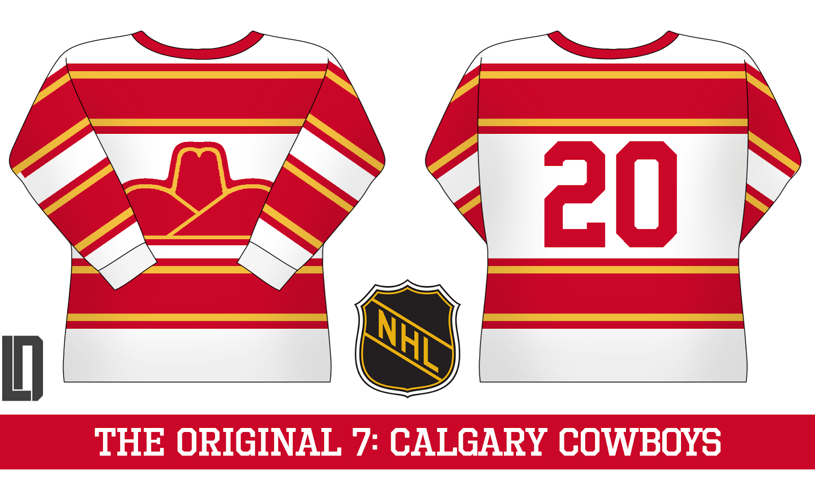
First up are the Calgary Cowboys. The current Flames take their name from their old location, Atlanta, so I named this team after the old WHA franchise.
Next: the Dallas Stars. We'll pretend the North Stars don't exist, and they take their name purely from Texas culture. The logo is a de-modernized version of the current crest, with the old bright colour scheme.

The least likely of all these teams are the Panthers, but in this fictional universe, they're a traditional hockey powerhouse. Like the Stars, the logo is a simplified version of their current alternate logo.

The Wild's design takes cues from their current green jersey, and adds a large white yoke. The logo is an unused one for their inaugural season.

The least far-fetched of the series are the Penguins, as the NHL had already experimented with Pittsburgh in the O6 era. I used their inaugural logo, and a variant of the upper-arm design used throughout their history.

The Canucks use an earlier version of Johnny Canuck from the old Western Hockey League, and a primarily green design taking cues from their current look.

Finally, the Blue Jackets use a barberpole look and a cannon logo.

What do you think? Comment below!
No comments:
Post a Comment