Friday, July 07, 2017

Adidas Alternates

There won't be any alternates in the NHL this season, but there reportedly will be a jaw-dropping amount the following season. I've seen a bunch of Adidas templates out there, but none have caught on with my style of concept-making. So, I decided to tweak a few templates I already use by adding a collar and shoulder texture.

For the Senators, I tried merging the modern Roman look with the everpopular barberpole look, and I like how it turned out.


Here's another one, this time for the Ducks, basically a mix of eras along with a couple design preferences.


The Hurricanes have tried to have traditional jerseys, but they're a team that should stay relatively modern. However, alternates are perfect opportunities to reach back and take looks from franchise history. I created a new logo based off the Whalers logo, and put it on a throwback uniform.


With the Adidas redesign, the Jackets had to choose between their primary set and their alternate. They chose their primary, a no-brainer to me. However, I still like the basic idea of the alternate they ditched, but wanted to redesign it in my own way. I changed the colour scheme to that of their primary, but replaced white with the cream colour from the alternate. I also completely overhauled the striping, adding a sash down the middle, which I feel compliments their design.


For the Stars, I mixed both of their logo eras to come up with a modern twist on their original, then tweaked the jersey it was worn with.


What do you think? Comment below!


Wednesday, June 14, 2017

Identity Swap: Welcome to Fabulous Toronto!

The Vegas Golden Knights are set to reveal their first uniform set next week. Their striping pattern is already known, along with the base colour and logo. I hadn't used them in one of my Swaps yet, so, looking through the other 30 logos, I found some parallels between them and the Leafs.

I replaced the helmet with the new Leaf, and took out their text in favour of a T, in Vegas' V style. Instead of the shading, I kept the Leaf's veins

I coloured the Leaf with Toronto's old silver, and enlarged the shield to fit. I used blue as a primary colour, and used a lot of white on the simple striping.

The numbers are pulled from the countdown to the logo unveiling.


What do you think? Comment below!

Saturday, June 03, 2017

Stars Over Tampa

The next All Star Weekend is officially heading to Tampa, keeping the divisional format from the last two years. I decided to make uniforms for the event.


I used a blue-black-grey-white colour scheme, using each of them as primary jersey colours. On the shoulders is a divisional crest inspired by the Lightning logo, and the player's team logo.

For the actual design, I used a coloured shoulder yoke, slightly elongated to a lightning stripe on the arms. A bold hem stripe complements the design.

What do you think? Comment below!

Sunday, May 28, 2017

White Hot

As of late, the Flames have chosen to emphasize black over white in their identity, which works, but it doesn't mean you can't be nostalgic once in a while!

I kept red as a primary colour, but recoloured the current crest to the 1995 version. From that mess, I salvaged the white and red shoulder length yokes, but instead of striping cutting them off, I gave them outlines matching the hems and logo.

At the end of the yokes, I added a little flame design that gives the set a unique feel, but doesn't overpower it.

I kept the equipment black, and the slightly outdated font, but I also added the former secondary logo to top it off.

What do you think?
Comment below!

Saturday, May 27, 2017

Colours of Colorado

I've got two concepts to show off today, both on Colorado-based teams. It's been a while since I made these, but they're up there with my favourite concepts I've ever created.

First, a Colorado team still active, the Eagles of the ECHL.

They have one of the nicest minor-league logos ever, and colourful ones too. But they currently stick with these ugly uniforms, that don't use most of those colours and have black as a primary colour.

Most concepts just stick the blue-yellow-red pattern on a blue jersey, then make a white version, but the colours fight for dominance. To fix this, I did something I rarely do- kept the black primary. And dare I say it works?

On the black jersey, I slapped down the classic pattern, but also layered Blue Jackets-esque piping underneath it on the arms, replacing red with yellow.

I applied that pattern to a faux lace collar, then applied one-colour numbers. Needless to say, I used the wordmark-free version of their logo.

For the white jersey, I kept most of the black jersey: the hems, the pattern, the collar and the Blue Jackets-esque black full-length yoke, keeping the black dominant. For a final touch, I added a yellow outline to the back number.

Next up: the Colorado Rockies, a defunct NHL team that moved to New Jersey and became the classic looking Devils. They didn't have bad uniforms per se, but their colour balance wasn't too good either.

Naturally, I completely contradict everything I said about the Eagles' uniforms. I kept blue as a primary, and actually added another colour on the home jerseys: white.

This wasn't done without a reason; I feel the trick to this type of colour balance is to keep almost the exact same pattern on both jerseys, just with a few elements tweaked for consistency's sake.

On the blue jersey, I made the dominant, eye-catching pattern equal stripes of yellow and red. I spaced out a white outline on either side, and added a white hem.

I kept the collar simple yellow and red, but used white faux-laces and a white Adidas logo. White once colour numbers finish it off, once again.

On the away jersey, I kept the blue upper arm fill, and most of the striping pattern, but added a blue hem to balance it all out, plus blue one colour numbers.


What do you think?
Comment below!

Thursday, May 25, 2017

Silver Wings

Let's get this out of the way: the Detroit Red Wings' uniforms are untouchable. (Spoiler alert: I touched them.) But in starting up a new series, in which I add a colour to each team's colour scheme, I saw a perfect opportunity to modernize the Wings brand, by adding a touch of silver.

I started off with the classic red sleeves for the white jersey, but removed the red cuffs. I added a silver stripe at a distance inspired by the logo's wheel, and reversed the pattern on the hem.

I outlined the logo, collar and numbers in silver, and reversed red and white for the home jersey. 


What do you think?
Comment below!

Wednesday, May 24, 2017

Canuck Simplicity

The Vancouver Canucks have a nice set, but a number of easily fixable issues currently present still bug me. So, naturally, I decided to fix them.

The Canucks already got it right with the one-colour numbers, but I chose a more classic font to go along with my logo choice, the modernized Stick-in-the-Rink.

Their home jersey is almost perfect, but they added one too many stripes on the away jersey, so I decided to do away with that and add an upper-sleeve fill to better incorporate the classic Vs I reinstated on the sleeve stripes.

Vancouver currently has a multitude of amazing secondary/primary logos, one of the best sets in the league, but I decided to leave the shoulders blank on this simple of a concept.


What do you think?
Comment below!

Tuesday, May 23, 2017

Identity Swap: Bolts and Stars

While I've made other concepts, I haven't stopped with my Identity Swaps. This time, I made a full swap between the Stars and Lightning.

This pair was obvious to make, since when the Stars announced their rebrand a few years ago, everyone freaked out about the possibility of the Stars copying the Lightning and playing Original 6 Dress-Up. (I guess we should've paid more attention to the Hurricanes, but that's another story.

The first swap, Dallas in the style of Tampa, was pretty straightforward. I replaced all blue with green, and all bolts with stars. For the pants, since stretching a star down the length of the pants wouldn't work, I decided to go with a mix between both teams' 90s styles.

On the away jersey, I replaced "Tampa Bay" with "Dallas".  


The next swap had the same eases and difficulties, but this time the bolt-star dimensions mismatch is more front and centre, on the primary logo.

To try to fix it, I tried many combinations, before coming up with this, which looks less layered than the Stars logo.

The rest was straightforward, replacing green with blue.

What do you think?
Comment below!

Monday, May 22, 2017

Classic Leafs

 When I saw the Leafs jersey redesign this year, I was disappointed. While it's beginning to grow on me, I still feel like there are tonnes of options they could've gone with to accompany their amazing new logo.

The first place I looked for inspiration was the socks they ditched after years for their new design. I wanted to keep those.

So, I went with an arm design based on those socks, with a little box for the TV numbers inside the middle stripe. On the hem, I only kept one set of Northwestern stripes on the hem to simplify the look.


I also liked their St. Pats jersey this year, but it only works on St. Patrick's Day, so I wanted to modernize them to be used as a full-time alternate jersey.

First off, I replaced all the green with blue, then reversed the blue and white to make it a dark jersey. I kept the simple striping pattern, but replaced the logo with a wordmark from the current leaf laid out like the original St. Pats jersey.

To stay consistent with the chest logo, I also put the numbers, in their current font, in the sleeve stripes. To finish the jersey off, I made a new shoulder patch, putting the old shoulder patch's veins inside the new leaf.

I really like how it came out.


What do you think?
Comment below!

Sunday, May 21, 2017

Blue Preds

Ever wanted to see the Preds back in blue? Look no further.

This is an update on an old Preds concept. White is prominent on the blue uniform, and the striping is tooth-shaped. For this concept, I tried recolouring the pick logo to better match the colours, The numbering is kept, and I tried out another type of Adidas collar.

What do you think? Comment below!

Saturday, May 20, 2017

Update and an All-Star concept

I was on the verge of calling it quits on the blog, but I do see there are a few readers out there. (I've gotten my first comment this week, so that's a plus.) So, I've decided to continue with the posts. They might not be quite as often as before, but I've still been making concepts, albeit at a lower rate.

To start things up again, here's an NHL All Star concept.


I've kept the format from the last two years, and put the game in Edmonton. Once again, each team will have their own jersey, but with the same pattern, based around the Oilers theme and their soon to be primary jerseys.

Each division has its own logo, basically last year's divisional logos in an NHL shield shaped like an oil drop. Each logo is the colour of the team's jerseys, so that's why I kept them as a shoulder patch along with the team logos on the contrasting yokes. On the chest is a star-studded NHL shield.

The two Western teams have the Oilers' colour scheme, with the home Pacific sporting Edmonton's primary orange and the Central sporting a reversed blue version. They share the same blue equipment.

The Eastern Conference teams sport black and white, with a touch of silver. They also share the same black equipment.

For the sake of presentation, I chose four likely captains; McDavid, Kane, Matthews and Crosby.

What do you think?
Keep commenting!

Sunday, March 19, 2017

Modernized Classics

This Friday, the NHL announced the next outdoor game: the NHL 100 Classic, taking place in Ottawa between the Senators and Canadiens. Only the logo has been released, which is similar to that of the Centennial Classic. With that in mind, I decided to create jersey concepts based off of the Centennial Classic's style.

For the Habs, I outlined their logo in silver, and modernized their chest stripe uniforms from their NHA days, by adding arm striping, putting it on the Adidas template, and removing the hem striping. I also outlined the outermost stripes with silver. For the Sens, I created a red version of their alternate jerseys, added some silver to the logo, and again outlined the outermost stripes with silver. Like the Wings and Leafs, I added modernized older alternate logos to the pants.


What do you think? Comment below!

Saturday, March 18, 2017

Feeling Blue

The Blues nailed their most recent rebrand. It's modern, but classic, and is familiar to Blues fans. However, St. Louis has an abundance of great eras to throw back to, so I tried to combine a few of them.

First off, I corrected the colour balance of their away jerseys, and curved the yokes like the Avs' current alternate jersey. The stripes now match, and are thinned out to give attention away to my new element. I took 5 thin lines from a music staff, and applied them to the chest and arms, lining up with the Blues' logo. I kept the current numbers, but moved them to the staff striping. 


What do you think? Comment below!

Thursday, March 16, 2017

Adidas' Oilers

With the temporary abolition of third jerseys under Adidas next year, the Oilers, who have a perfect trio, have to take away either their blue or orange jersey from their arsenal next year. Reports have them going with their orange alternate, but I wanted to combine the two's looks.

My set thickens the middle stripe on Edmonton's current primaries, and adds a matching yoke outline. I matched this simple striping reminiscent of their third jersey throughout both sets, to add a degree of consistency, that, in my opinion, isn't quite there yet.

What do you think? Comment below!

Wednesday, March 15, 2017

Est. 1997

The Hurricanes had one of the most unique and actually good-looking jerseys since they moved from Hartford... until 2013. They tossed all their uniqueness out the window, and came out with two mismatching Team Canada lookalikes. Once again, I wanted to reinstate that uniqueness by embracing their '90s origin...

...with the Fisherman template! It wasn't a good look for the Isles, with all their history, but I don't think it's a bad look for the 'Canes. I kept the wave, but changed up the pattern to match the logo. I used all black equipment, their current font, old shoulder patches, and lost the Fisherman yoke to simplify the look. The striping matches on both jerseys.


What do you think of this crazy look? Comment below!

Tuesday, March 14, 2017

Kachina Komeback

The Coyotes' inaugural jerseys weren't a particularly bad idea- they were just executed in a 90s eyesore way. They were unique; something their first redesign didn't. That desert red and white set wasn't a bad idea either, but they weren't unique either. Their most recent set, although maligned originally, had the right idea with the addition of black. I wanted to combine all those ideas into a classic and modern style that I employ so much.

I used black yokes, like currently found on the 'Yotes jerseys, on the desert red jersey, with a simplified Kachina pattern underneath. I flipped that arrangement upside-down on the hem. On the white jersey, I removed the black yokes and added desert red cuffs. I swapped the A-paw patch on the home shoulders for the updated AZ patch, like their current jerseys. These aren't as simple as my first go at this look, but I think it works.


What do you think? Comment below!

Monday, March 13, 2017

Florida's Flag

As you know, I like the Panthers' new logo and uniform set. One of the rejected ideas was a chest stripe in the cross shape from the Florida state flag. I already made a concept based on that idea, but I wanted to actually replicate the flag itself in a way.

I first converted the shield logo into a roundel, and put that on a single colour cross chest stripe. I did the same for the sun in their branding, though on a single arm stripe. I kept the shoulder numbers, and added the "Florida" shield itself to the pants.


What do you think? Comment below!

Sunday, March 12, 2017

Flashy Bolts

The Lightning don't have a bad uniform set, but it's the simplest in the league. If there were any team to have flashy uniforms, it's them. I wanted to correct that, while incorporating some of their history into the set, too.

I changed the main colour to black. I kept the shoulder yokes and general colour arrangements from their Cup-winning set, but added lightning bolts on the the hems and arms. I also used a recoloured current logo.


What do you think? Comment below!

Tuesday, March 07, 2017

Snowcapped Avs

In the past few days, I redesigned teams with no need of a redesign. Today's concept performs a complete 180; fixing the Colorado Avalanche. Their current jerseys are an abomination, and let's face it: their great 90's jerseys are a little outdated and busy.

My solution turns the mountain hem stripes into a snowcapped mountain-top yoke design, while keeping the same colour arrangements as the classic set. For a less busy look, I removed all shoulder patches, and used simple arm and hem striping shapes. 

What do you think? Comment below!

Monday, March 06, 2017

Perfecting the Rangers

I'm back with more concepts for teams I judge to be in the upper echelon of logo and uniform design. That's why we call them concepts, right? This time, the New York Rangers are up, but instead of a full-on redesign, I'm just perfecting a few things.

Their home jersey remains more or less intact; I just out it on an adidas template. The away jersey is where the "big" changes happen. Matching their classic yoke, I used the same striping pattern as the home jersey, plus a blue stripe above and a scooped hem below to keep the pattern visible. These aren't really drastic changes, but I think it helps the consistency of the overall set and just has a generally more pleasing aesthetic.


What do you think? Comment below!

Sunday, March 05, 2017

Back in Black

The Blackhawks currently have one of the nicest, if not the nicest, uniform sets in the league with their primarily red jerseys. However, their first uniforms were predominantly black. Would they still be up there in the rankings if they still used black as their primary colour?

On the home jersey, I used a white-red-white pattern on the hems, and doubled it on the arms. Consistency is the key for this set, so I matched that pattern on the pants, collar and socks. On the away jersey, the white and black are reversed, but black upper-arms are added. Throughout the set, I used single-colour numbers, something I really enjoyed on their 2015 Winter Classic uniform.

What do you think? Comment below!

Saturday, March 04, 2017

Golden Pens

Pittsburgh has such nice logos, jerseys and colours, that they need a third jersey. Their Stadium Series jersey has some some nice qualities, but isn't all the way there. I wanted to improve that uniform while throwing back to some of their other uniform history.

The jersey obviously had to be yellow. I primarily took inspiration from their white jersey in the 90s, using its triangular yoke. I matched the pattern to the logo from their Stadium Series jersey, and used the triangular captaincy patch. To keep it realistic, I also used their current gear.

What do you think? Comment below!

Friday, March 03, 2017

Gnashville

The Predators have one of the nicest modern uniform sets in the league, in my opinion. Besides ruining it with sock swaps, pant stripes, and gold helmets, they set a prime example of how a modern expansion team should look. I wanted to take away their chest piping while keeping the tooth motif.

I moved the arm striping to the upper arm, while thickening the white stripes to resemble the teeth in the logo. Their guitar pick patch is placed on both shoulders, while the mistakes of the past few years have been fixed.

What do you think? Comment below!

Thursday, March 02, 2017

Colours of Winnipeg

In my opinion, the Jets have some of the top uniforms in the NHL right now: great colour balance, mix between classic and modern, a nice logo, and an outstanding Heritage Classic uniform. This isn't a detriment to the set, but their logo has a whopping six colours in it, and if that wasn't enough, they used yet another colour in their jerseys. In their defense, the jerseys only have three colours, but I still wanted to make a set using all the colours in the logo.

I used the design illusion of identical striping on both jerseys, using coloured upper arms on the away and coloured cuffs on the home. The striping uses a two tone stripe of grey, along with a thinner stripe of red. I elected to go with no shoulder logo, as the striping was busy enough. To top it off, I outlined the hems and straightened out their number set.
What do you think? Comment below!

Wednesday, March 01, 2017

Devilish Alternate

With traditionalist manager Lou Lamoriello in charge for most of their existence, the New Jersey Devils have never had a third jersey. With them getting a new uniform set next year, one could speculate the introduction of a black third in 2018. Here's my take:

I didn't shy away from using complex striping. In fact, I basically recreated the logo in stripes. There are a lot, but I don't think, without anything on the shoulders, that this is a busy look.

What do you think? Comment below!

Tuesday, February 28, 2017

Sharks in Black

San Jose has one of the most unique primary colours in all of sports: teal. It looks great, and they haven't had a bad uniform set, in my opinion, to date. I've always hated the idea of them in black, but lately I've been warming to it. It would be a nice alternate look.

In this set, I used a simple two stripe pattern on the arms, which is repeated on the pants, and a plain hem. The current logo takes center stage, with the triangle slightly recoloured.

What do you think? Comment below!

Monday, February 27, 2017

Superior Sens

Almost any Senators concept is better than their current templated mess. Most use striping resembling that of the current alternate jersey, but I wanted to take a different route, using a pattern matching the current unused alternate logo.

Both uniforms have the same pattern, the home jersey with white outlining the laurel striping, and the road with red hem and cuffs. Black gear completes the set. It's a simple concept, but one that I think would do great in Ottawa.

What do you think? Comment below!

Sunday, February 26, 2017

Throwback in DC

The Capitals are currently one of the few teams still bound by Reebok's Edge templated designs, but theirs mostly doesn't look bad. I'm among those that think the Weagle shoulder patch should be primary, but what if the Caps had to keep their wordmark as primary?

I wanted to use more white on the set, in general, so I recoloured the wordmark to the original colouring, and used a large white shoulder yoke on the home jersey. I also used mainly white striping. I simply recloured it for the road uniform.

What do you think? Comment below!

Saturday, February 25, 2017

Thundering Cats

I'll try to post more regularly from now on, for the whopping one reader that clicked "Yes" in the poll I set up on the side of the page. For those who do read and haven't answered, it takes two seconds to be done with it. Or, if you have more time on your hands, comment!

Anyway, on to today's concept.

I had an idea for a swap between NHL teams and their AHL affiliates, which hasn't really panned out, but I have at least one concept to share with you: a swap between the Panthers and the Thunderbirds.

The logo adds an outline to the current Panther, then puts it in a recoloured T-Birds shield, and topping it off is a tweaked wordmark. I applied that logo to uniforms inspired by the inaugural Panthers' and current Thunderbirds' set.

What do you think? Comment below!

Saturday, February 18, 2017

New NY

The New York Islanders currently have one of the nicest sets in the league. Their logo is timeless, and manages to cram a ton of significance inside a circle without looking too busy. Their jerseys have a great color scheme, and throw back to their original season. They've definitely had their share of mishaps, however, namely the Fisherman set, Edge redesign, and their awful string of alternate jerseys. Their most recent one is plain, boring, and has nothing to do with their color scheme. But the striping and logo do have potential, so I decided to modernize the Islanders' look for a new era.

I used the simplified NY logo currently found on their black jerseys. Their biggest accomplishment as a franchise is the string of four back-to-back Cup wins, which are seen in their logo's stick tape and alternate jersey striping. I decided to thicken those stripes, and make them orange on both the home and away jerseys. I added a white shoulder yoke on the home jersey, and a blue full length yoke on the away jersey.


What do you think? Comment below!

Saturday, February 11, 2017

V for Vegas


After this banner was pointed out on shop.nhl.com, I decided to make a Vegas concept based on the striping seen on the right side of the graphic.


What do you think? Comment below!

Wednesday, February 08, 2017

PA Sketches

The two NHL teams calling Pennsylvania home are in the league's upper echelon when it comes to jersey design. But their logos and history give inspiration for other great designs, which I try my hand at today.

The Penguins just switched to their Cup-winning 90s set, with a few changes here and there. The one thing that bothers me is the home jersey's inconsistency; I'd be happy if the hem stripes matched the arm stripes. Here, I use a completely different design, with a striping arrangement reminiscent of their original Vegas gold uniform set, with the pattern and colours from their current set.


The Flyers current uniform is an Edge-ified version of their original set, with a unique full length yoke that is classic and modern in my opinion. Before this set, however, was a modern design that didn't look good. With the popularity of their 2011 Winter Classic jerseys, the current design was quickly put into place. But those modern jerseys show that the Flyers could go with a modern design, which I tried to do here, adding more black into the look, using striping from the logo and throwing back to the old Philly Quakers.

What do you think? Comment below!

Saturday, February 04, 2017

Identity Swap: Devilish Sharks


I was creating my prediction for the Devils, when I came up with the idea for a swap between them and the Sharks. Check out my full Identity Swap Series on the Creamer Boards!

For the prediction, I evened out their original red striping pattern but simply adding another stripe to the current pattern, while using black.

New%20Jersey%20Devils%20Concept_zpsp04dj

The Sharks and Devils both have locator names with two words, the last one ending in J, so I thought this would be a natural swap. After adding a tail and fin to the J, however, I realized that the S wouldn't fit easily like the N does. So I cut out a bit of the J to warp it into an S, with a hint of a J in the overall shape and body. The teal really does go well with black and white.

San%20Jose%20Sharks-New%20Jersey%20Devil
What do you think? Comment below!

Wednesday, February 01, 2017

Fixing the Rocket

The Habs' AHL affiliate, the Rocket, blasted off by unveiling logos and uniforms a couple days ago. I don't like every element, so I decided to fix them, by replacing their mess of secondary logos with a Rocket Richard logo, and changing the number font.

What do you think? Comment below!

Tuesday, January 31, 2017

Golden

With no one even knowing what adidas NHL jerseys look like, or any other history for the NHL's 31st franchise, the Vegas Golden Knights, we have no idea what their inaugural jerseys will look like. I took a stab at them, invoking a sash from the Las Vegas flag and some red trim around a primarily grey jersey.
What do you think? Comment below!

Monday, January 30, 2017

The Original Seven

What if the NHL's Original Six was an Original Seven? And what if those Original Seven didn't include the actual O6? That's what I explore in today's post.

First up are the Calgary Cowboys. The current Flames take their name from their old location, Atlanta, so I named this team after the old WHA franchise. 

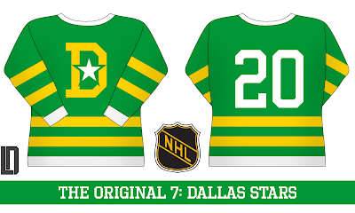
Next: the Dallas Stars. We'll pretend the North Stars don't exist, and they take their name purely from Texas culture. The logo is a de-modernized version of the current crest, with the old bright colour scheme.


The least likely of all these teams are the Panthers, but in this fictional universe, they're a traditional hockey powerhouse. Like the Stars, the logo is a simplified version of their current alternate logo.


The Wild's design takes cues from their current green jersey, and adds a large white yoke. The logo is an unused one for their inaugural season.


The least far-fetched of the series are the Penguins, as the NHL had already experimented with Pittsburgh in the O6 era. I used their inaugural logo, and a variant of the upper-arm design used throughout their history. 


The Canucks use an earlier version of Johnny Canuck from the old Western Hockey League, and a primarily green design taking cues from their current look.


Finally, the Blue Jackets use a barberpole look and a cannon logo.


What do you think? Comment below!